


Carnes do Bengo
Brand Identity
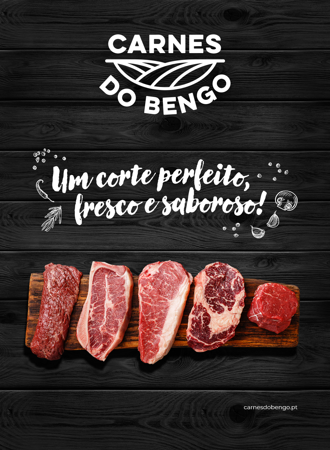
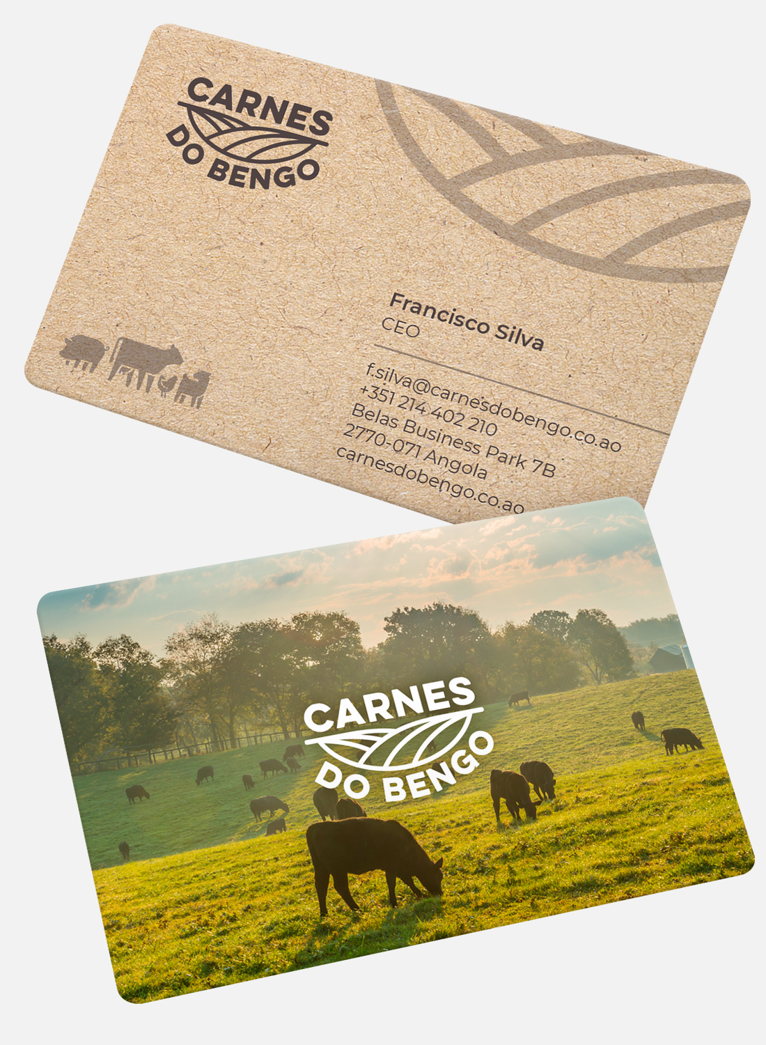
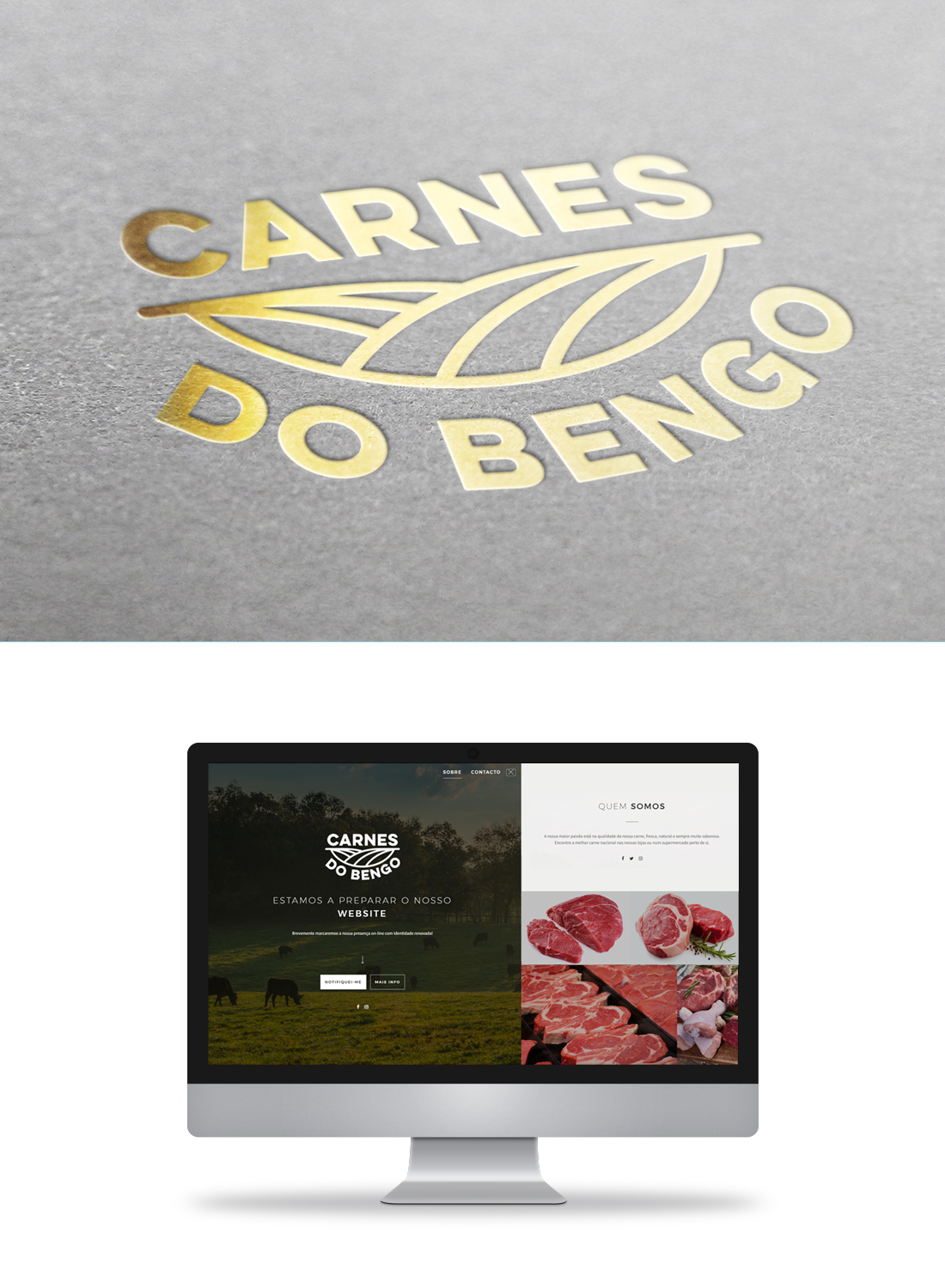
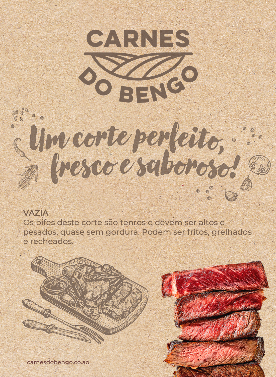
Draft Flow Design created the Carnes do Bengo brand, an identity inspired by the rolling pasture valleys that give rise to the brand's premium meat. The logo pairs bold typography with an illustration evoking green hills and open fields, conveying natural origin and quality from the very first impression.
The colour palette and fine-line illustration were designed to work both on their own, as a standalone mark, and layered over product and landscape photography.
The Goal
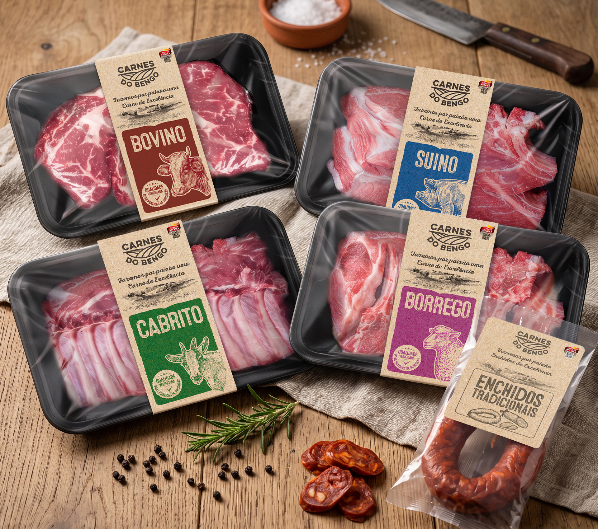
The goal was to create a packaging system that reinforces the brand's promise of quality at every physical touchpoint with the consumer: the bands wrapping fresh meat trays (beef, pork, goat and lamb) and the label for the traditional sausages packaging.
Each band follows a colour code by meat type, paired with an illustration of the respective animal, staying true to the logo's visual language and reinforcing the "Verified Quality" seal across every package.
The Result
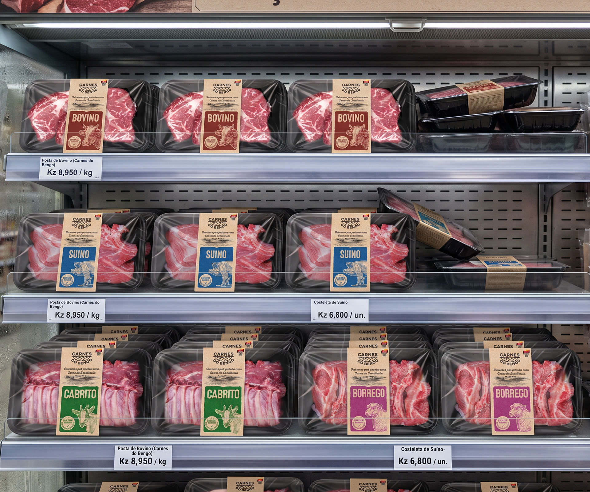
The result is a consistent packaging system across the full Carnes do Bengo range, from beef to lamb, goat and traditional sausages, with a clear colour code that makes in-store identification quick and easy.
The packaging reinforces the brand promise "Made with passion, meat of excellence," pairing the Angolan-origin seal and the verified-quality commitment with every product in the range.